How we use Midjourney in HobbyStudio to create designs
When I first came across to the possibilities of Midjourney I was amazed, I had only seen something similar in the ,,Black Mirror”. That happend right around the time when we started a very interesting graphic design project that gave the creative team of HobbyStudio an opportunity to use the advantages of AI design.
Project description: We had to create a wine label, focusing on the Georgian wine and the diversity of Georgian vine, that is grown miscellaneously in different parts of the country- In Georgia, you can find numerous microzones where the vine is originated. Depending on the location of the vine, every type of wine gets specific taste and fragrance.
Our graphic designers decided to try working on the Midjourney to create the very first version of the illustration. Till now, we have only used it for fun. Almost every member of our team made artificial intelligence to draw the various scenes from The Knight in the Panther's Skin, even the fantasy of the bear and the piggy wedding which have been housed in our office for months now. (See the photo below ↓)
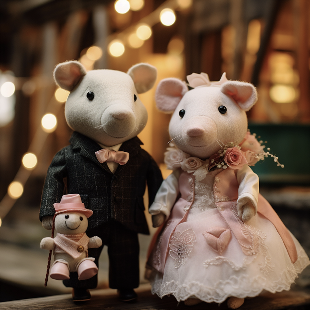
Andrew and Gigi.
The main problem with working on Midjorney is that it is so easy to have the visually beautiful result but it is complicated for it to be acceptable. Moreover, most of the time it does not even meet the initial essence of the technical task. It is important to learn how to communicate with the artificial intelligence which is not as simple as it seems.
So, now we should move on to the actual working process of the Midjourney.
First and foremost, we will start with generating the vine - one of the main objects of the illustration.
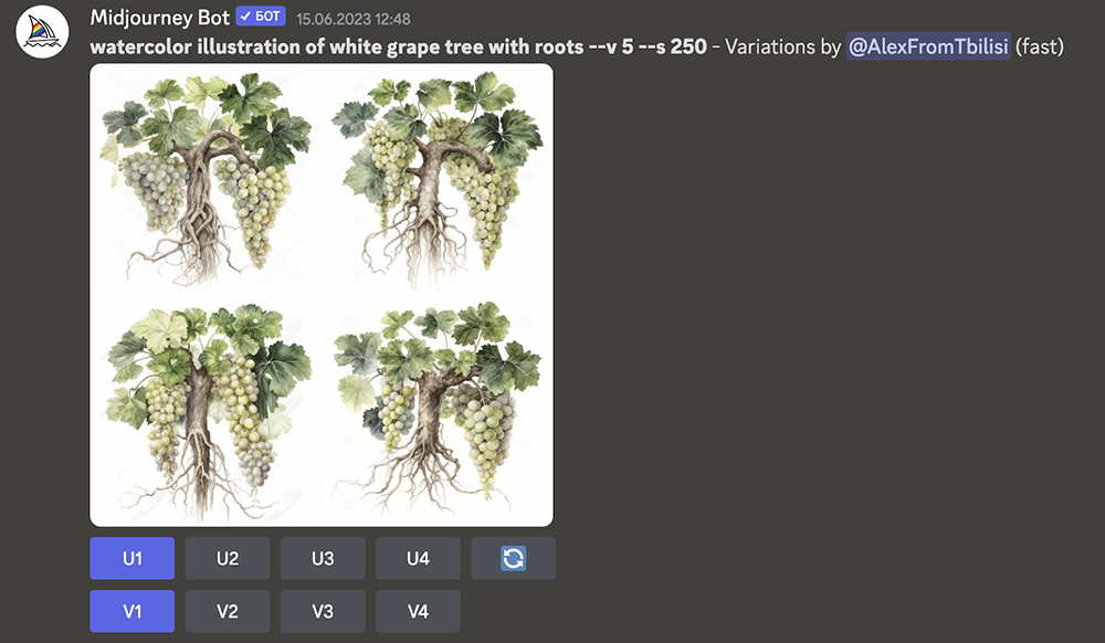
The first version seems interesting.
Let's stop to this part for now. As you can see, the designer was given a pretty fascinating result and in a short time too. It can already be used for the wine label.
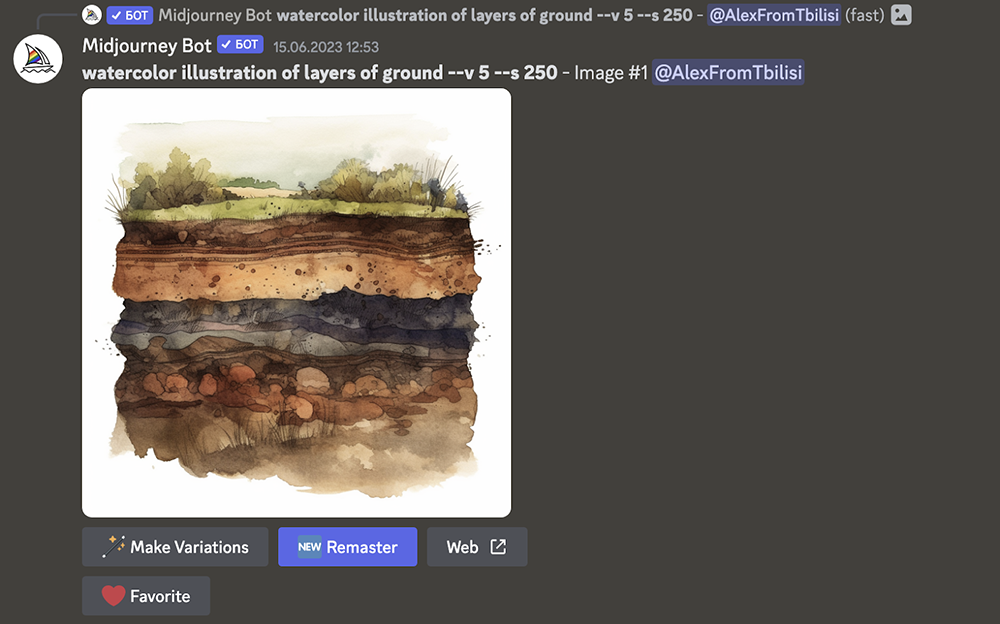
Let's move on to the layers of the soil. We will get back to the vine later.
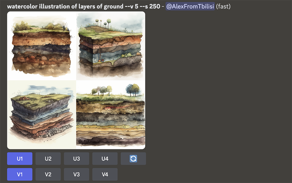
The first version already seems interesting. The designer is thinking that the soil is in the right angle and the color palette is also acceptable.
Now we will create the variations of the version mentioned above. It is very close to what we need but let's see - we may generate the better ones too.
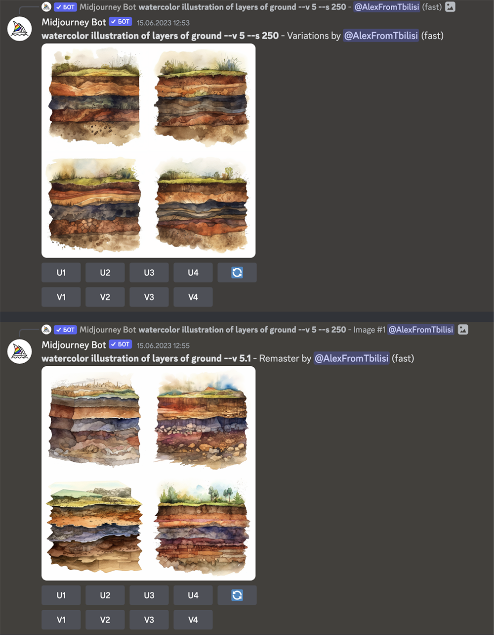
We have the visual material of the element and the result is perceptible to the eye.
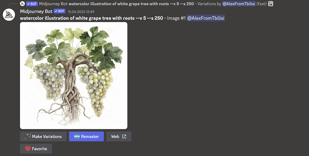
Let's go back to the vine. We have observed that with the same text we can produce a similar, but visually, a slightly different version.
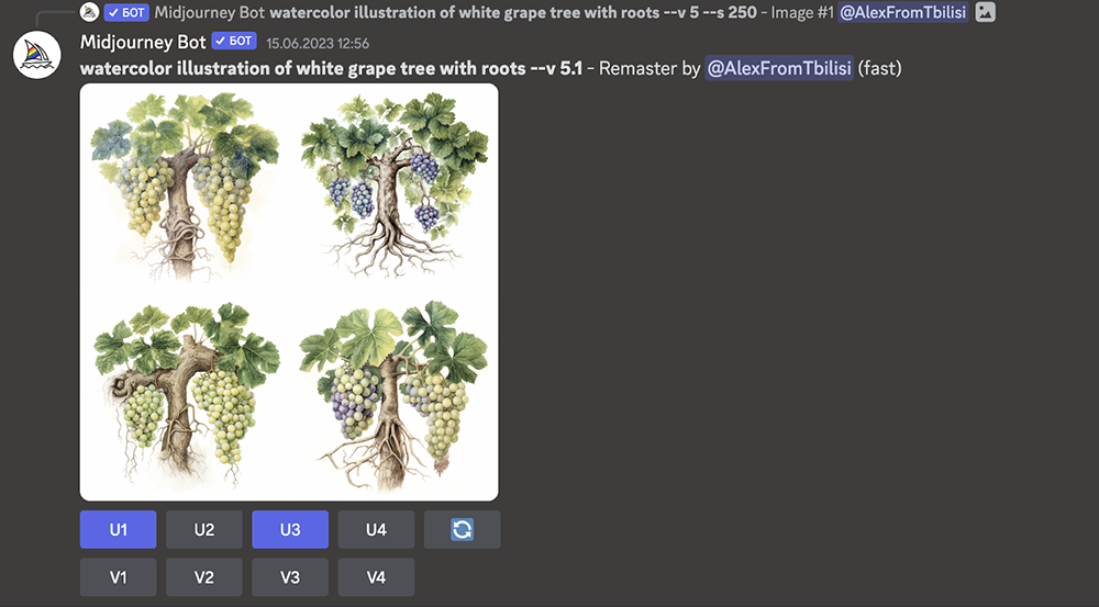
In the past, a painter would need at least one hour for that kind of illustration. Now we can generate various and unique versions in a few minutes. Which, we can agree on that is very effective.
Now, we will add some of the new versions too, specifically, each of the cluster of grapes.
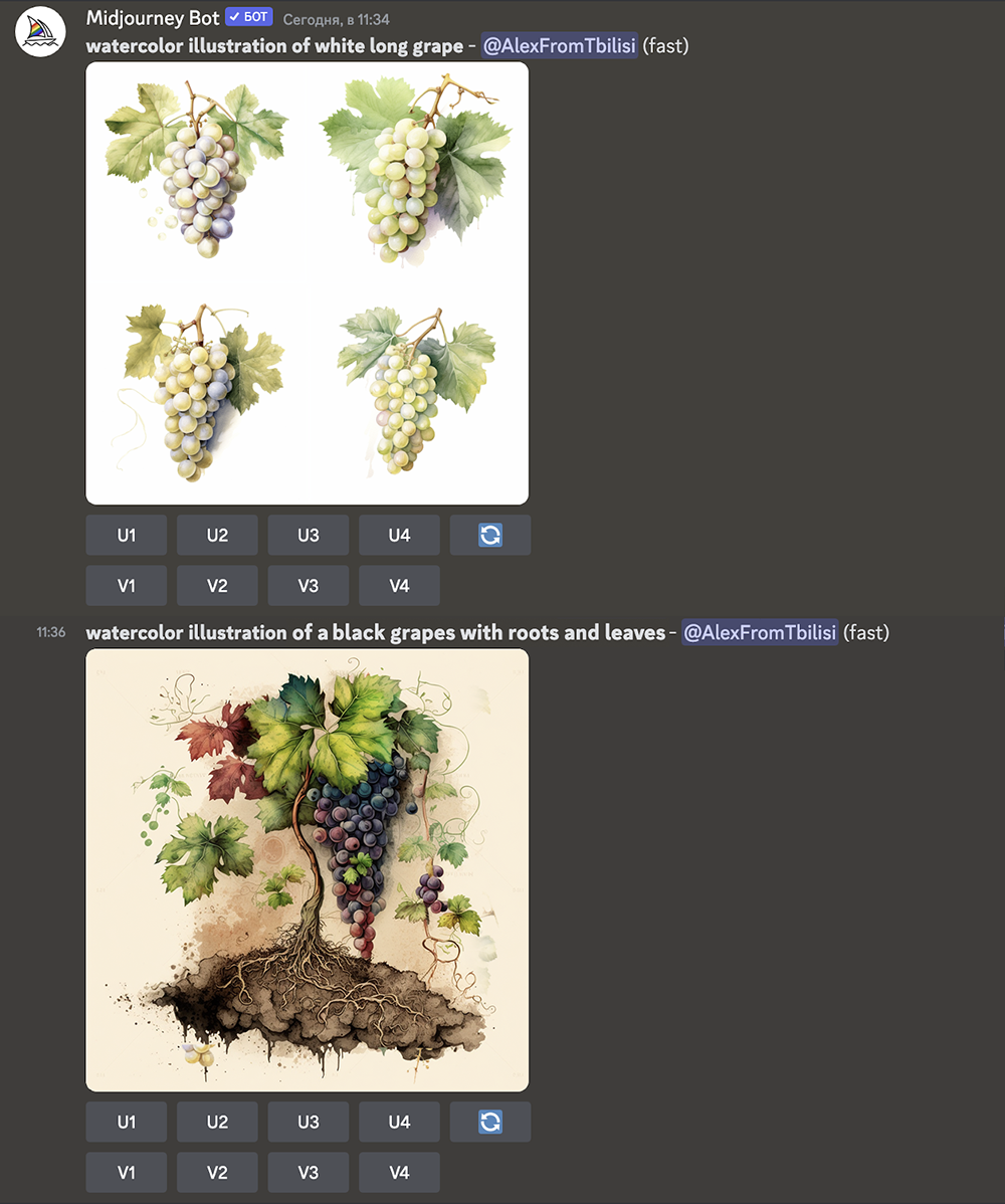
We will take two of the offered versions in a bigger size.

As you can see, the working process is going further in a short time, if you know what you are looking for and are able to write prompts skilfully.
Obviously, what we receive from the Midjourney is not a ready-made design. It is an initial source which can be successfully used in our field.
Following to that part, our designer worked with our art director on the fonts and together they created the composition of the clear space. That could be done with the paring of the beautiful fonts and colors.
As for the vine, it went through the various modifications in the working process and in fact, it does not look like the Midjourney versions at all. The soil has been altered a lot, however, the AI essentially contributed to the creation of the visual element.
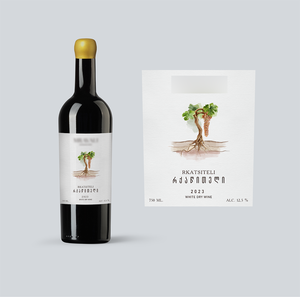
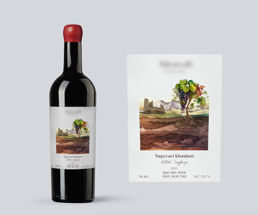
Overall, it can be said that the color of the soil was made more like the pastel color. The background was also refined on the basis of the towers and the mountains.
The aim of this article is that we wanted to show you all of how effectively you can improve the working process, moreover, you can have the compelling and distinctive result when you create the visual content.
In the end, our client decided to choose another version of the design, which you can see in our portfolio afterwards. The last step for the wine is to be displayed on shelves of supermarkets.
The designs were created by:
Abo Akhvlediani
Teo Aladashvili
Art direction: Alexandra Nazarbegovi